
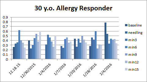
This data belongs to a 30 year old patient who has had severe allergies for years. After just a month of weekly (more or less) acupuncture she feels much better. In fact her symptoms started feeling better after just a few visits. So beautiful story!! Unfortunately, her data is not so beautiful.
Each group of bars represents a treatment date. Each bar represents 3 minutes of stress data, the smaller the bar, the less the stress. The dark blue bar is the needling segment, if it is missing, then monitoring was started after needling. Ideally, I like to see the stress decrease during treatment after needling and over time.
 So her stress levels are “messy.” Though she has some decrease after needling, it’s not smooth, and she spikes up at the end rather frequently.
 This represents just her parasympathetic activity. Just her “rest and digest” (Hf normalized band.) This measure you would like to see go UP to show parasympathetic enhancement. So you see that it increases more smoothly after needling, but still messy, and certainly not beautiful.
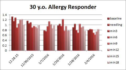 However look at this data. This is her DFα band. DFα is a nonlinear measure of HRV and sometimes can give different information depending on the patient’s physiology. DFα you’d like to see decrease indicating decrease in stress response. Again, not particularly beautiful, BUT you do see a clear overall decrease in this band, which shows a definite decrease in stress response over the month of her treatment. Nice!

